From Complexity to Clarity
The water purification category is complicated to shop so consumers tended to just buy the brand they knew. Heck, they all looked alike anyway!
BrandtBrand partnered with the PUR brand team to meet this challenge head-on. Together made some hard decisions to focus on PUR's serious, scientific point of difference: PUR has superior filtration. The problem was getting consumers to 'snap out of it' and see PUR is superior, and that benefit that mattered most to consumers and their families. "Unapologetically Bold" was the big idea we zeroed in on.
We believe the brand that reduces the confusion will naturally go in the cart faster
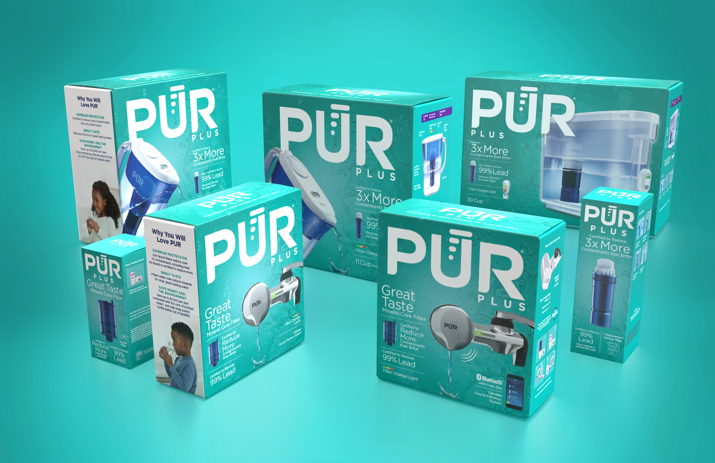
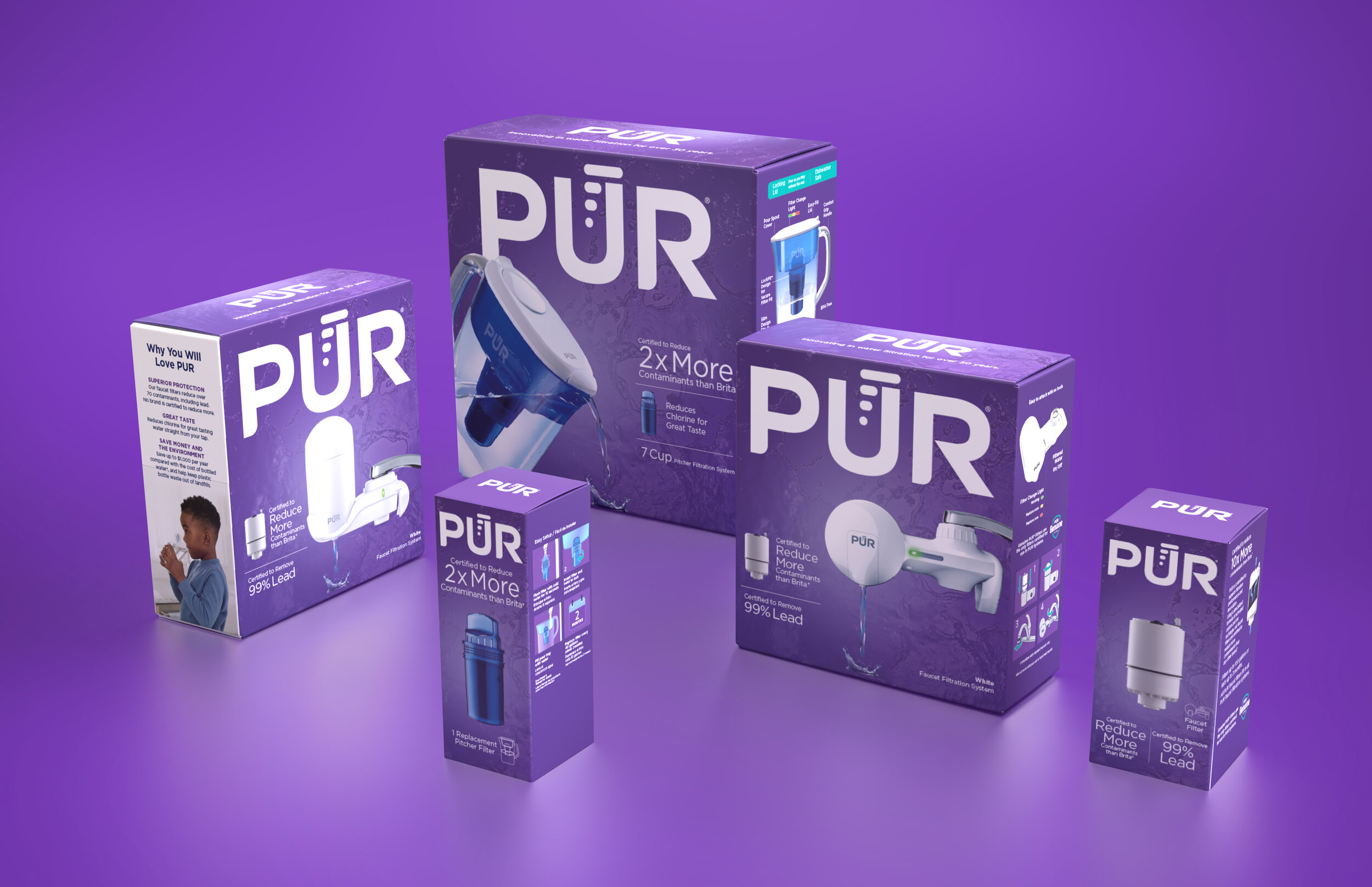
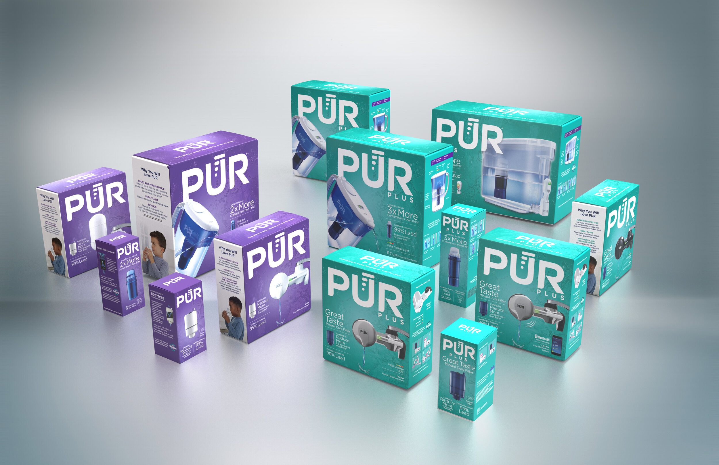
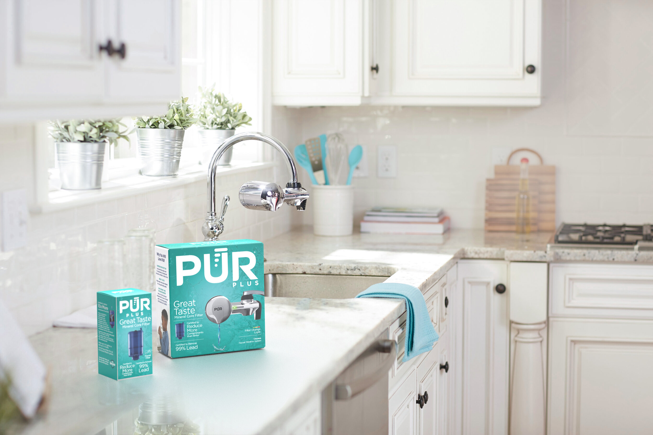
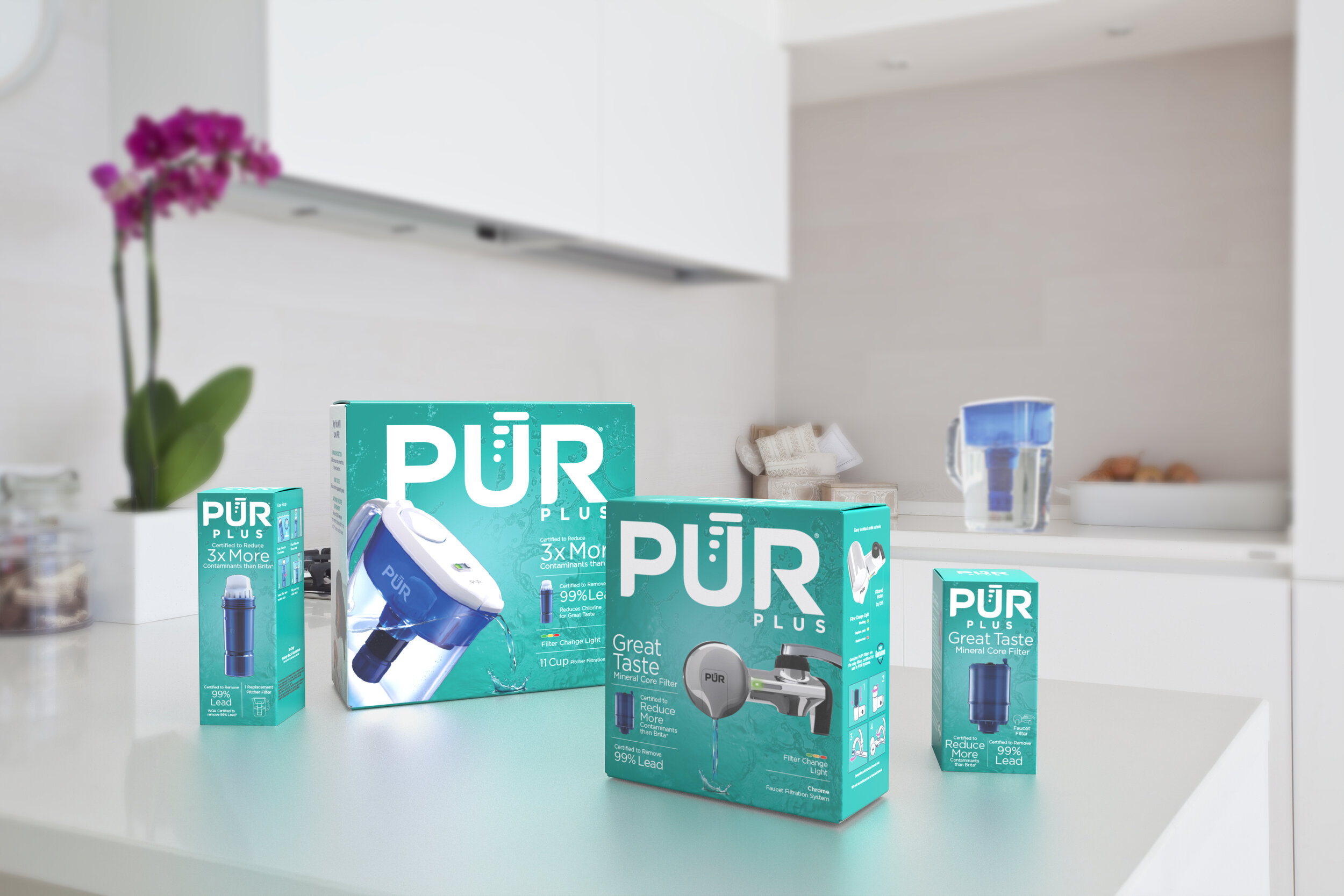
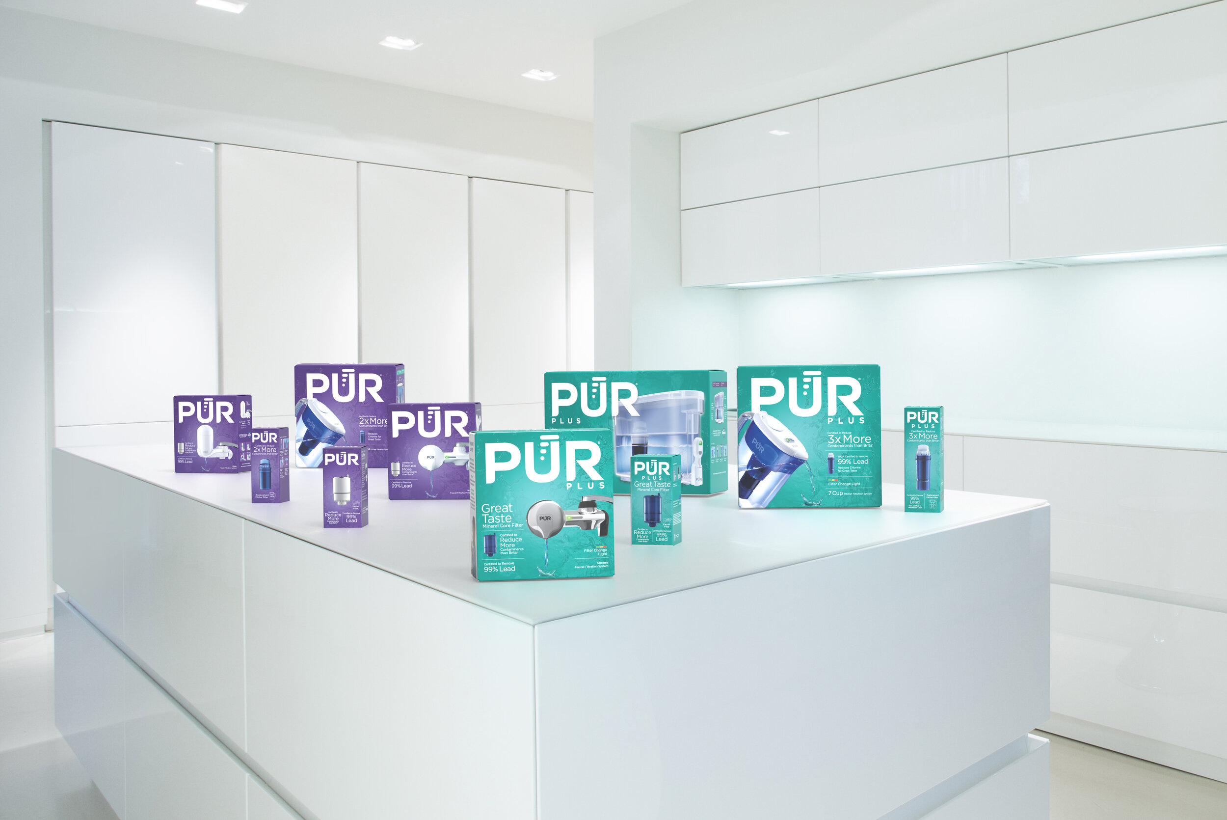
Our design communicates that PUR is superior through proud billboarding of the PUR identity, cleaning up everything on the front apart from the #1 filtration numbers, and finished off with a totally new bold color palette that helps product navigation. Turning a "brainer" into a "no brainer" at the most critical point in a consumer's decision making.
The result is the cleanest looking packaging in the category.
“In a variety of consumer marking roles, I have worked with the BrantBrand team for many years. Again and again, I have found the team to be great partners; insightful, strategic thinkers, flexible, always pushing for the best work for our business. No matter the category or how challenging the brief– they consistently deliver world-class work.”


